Letterboxd Redesign
A UX redesign of the Letterboxd app focused on improving social discovery and content clarity.
Problem:
Letterboxd’s original interface prioritized recent activity and trending films, but didn’t offer users intuitive ways to discover new friends or revisit past reviews. Key features like search and user profiles lacked hierarchy and visual clarity, making navigation cumbersome.
Solution:
A research-driven redesign of the Letterboxd app that reimagines the home screen, search flow, and movie pages. The goal was to improve social discovery, reduce cognitive load, and create a more intuitive user experience.
Impact:
An enhanced digital film platform which makes it easier to connect, explore and engage with content.
My Role:
User Research, UX/UI Design, Branding, Visual Design, Storytelling
Project Overview
We started with user testing and heuristic analysis to uncover pain points. Users struggled to find friends, navigate cluttered movie pages, and use the search feature effectively. A quick competitive review helped us identify common patterns in discovery and social features.
We focused on redesigning the home screen, search, and movie profiles. After wireframing in Figma, we tested and refined each layout for clarity and ease of use. Feedback guided changes to spacing, button placement, and content flow. The final design feels cleaner, faster, and more social.
Design Process
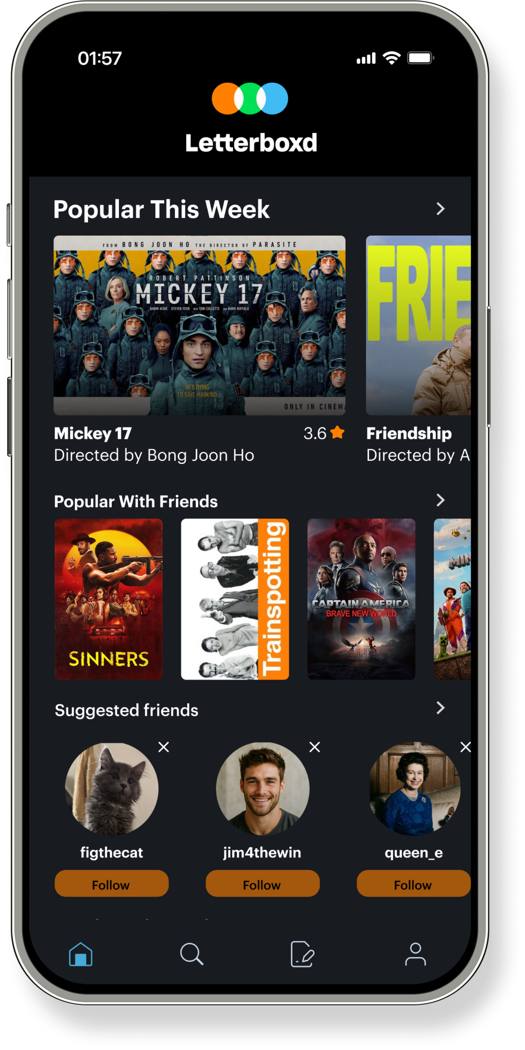
The redesigned home screen introduces clearer visual hierarchy and new features that foster social discovery. We added a “Popular With Friends” section to highlight films trending in a user’s circle, and a “Suggested Friends” carousel to encourage connection based on shared interests. The updated “Popular This Week” area now includes larger thumbnails with titles and directors, making content easier to browse at a glance.
Home Screen
Before
After
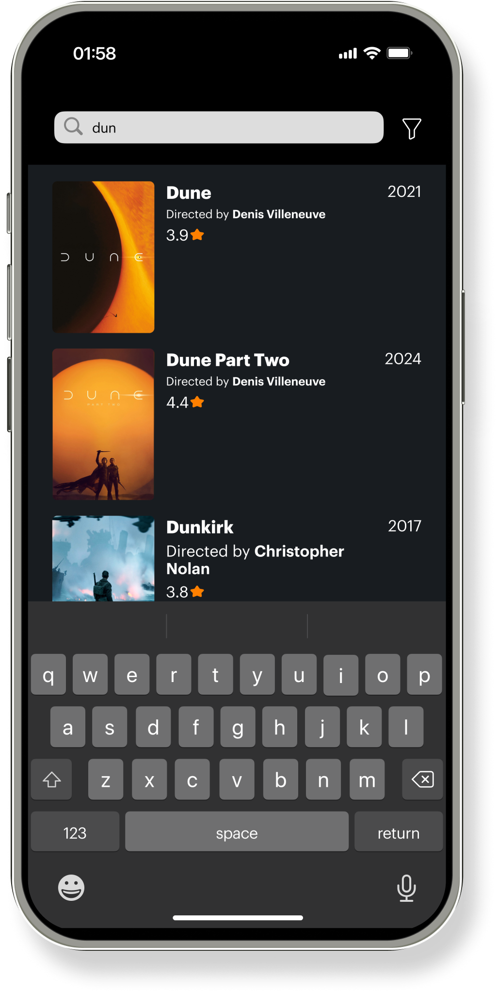
The redesigned search screen simplifies the experience with a cleaner layout and clearer hierarchy. We removed distracting filters and tabs to reduce clutter, and introduced larger thumbnails and ratings directly in the results to help users make quicker, more informed decisions. The updated design also improves readability and focus, making the search process more intuitive and visually streamlined.
Search
Before
After

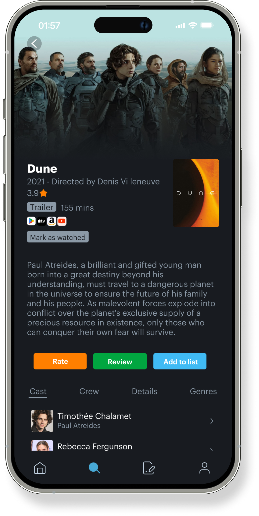
The redesigned movie profile page improves clarity, structure, and usability by prioritizing the most relevant content. We elevated the movie’s rating, trailer, and watch options for quick access, and moved key actions like “Rate,” “Review,” and “Add to List” into a bold, color-coded button row for better visibility. The layout now features a cleaner synopsis, a tabbed section for cast and details, and removed distracting ad placements—creating a more focused and engaging experience.
Movie Profile

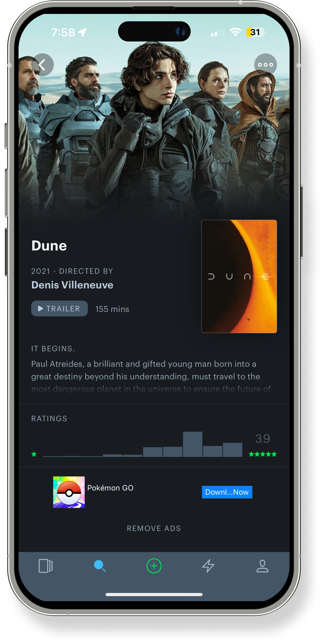
After
Before
Lessons Learned +
Moving Forward
This project reinforced the importance of clarity, consistency, and user-centered design. I gained experience translating research insights into actionable interface improvements while collaborating closely with a cross-functional team. Iterating through feedback highlighted the value of thoughtful hierarchy and purposeful interaction design. The process deepened my ability to balance aesthetic decisions with functionality, ensuring the final product supports both user engagement and ease of use.