Kate Bingaman-Burt Interview Tabloid & Site
A print and mobile experience that turns a long interview into an approachable visual story.
My Role: Interview, content editing, visual direction, typography, tabloid layout, and mobile UX.
Project Overview
Problem:
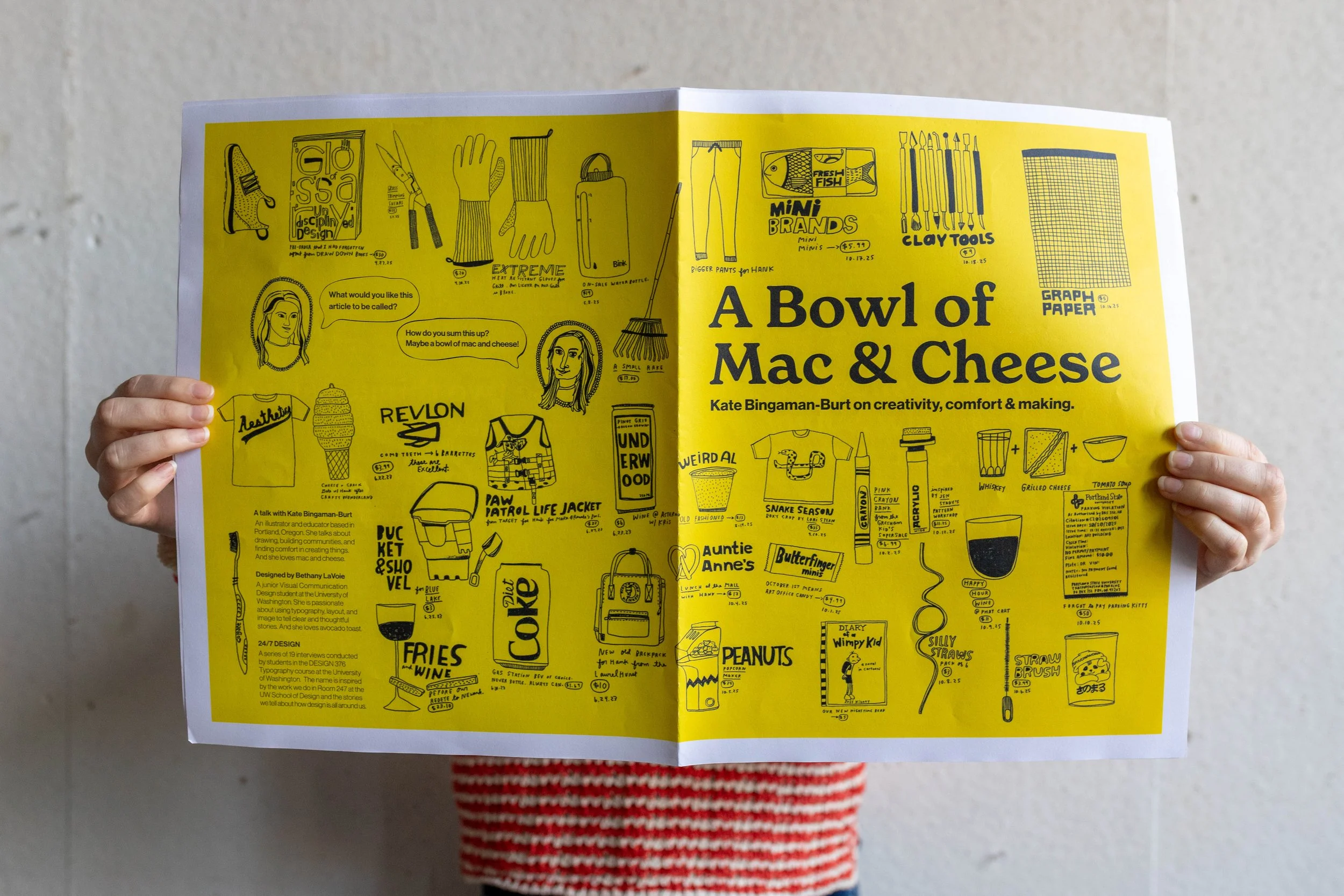
Turn a long, text heavy interview with Kate Bingaman Burt into an experience that feels as approachable and energetic as she is, in both print and mobile.
Solution:
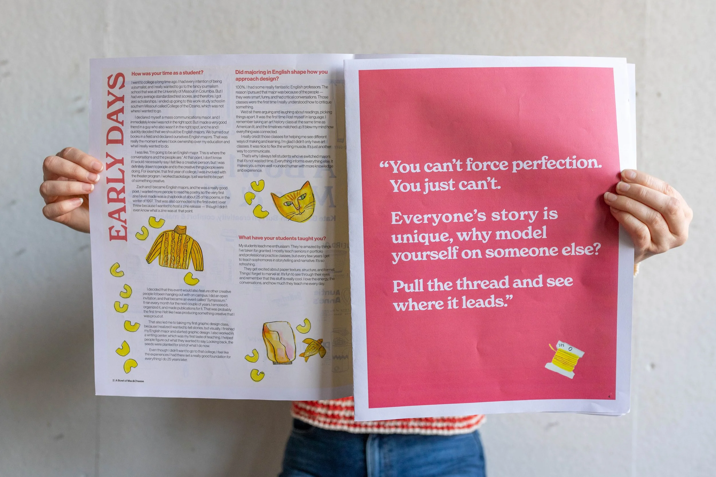
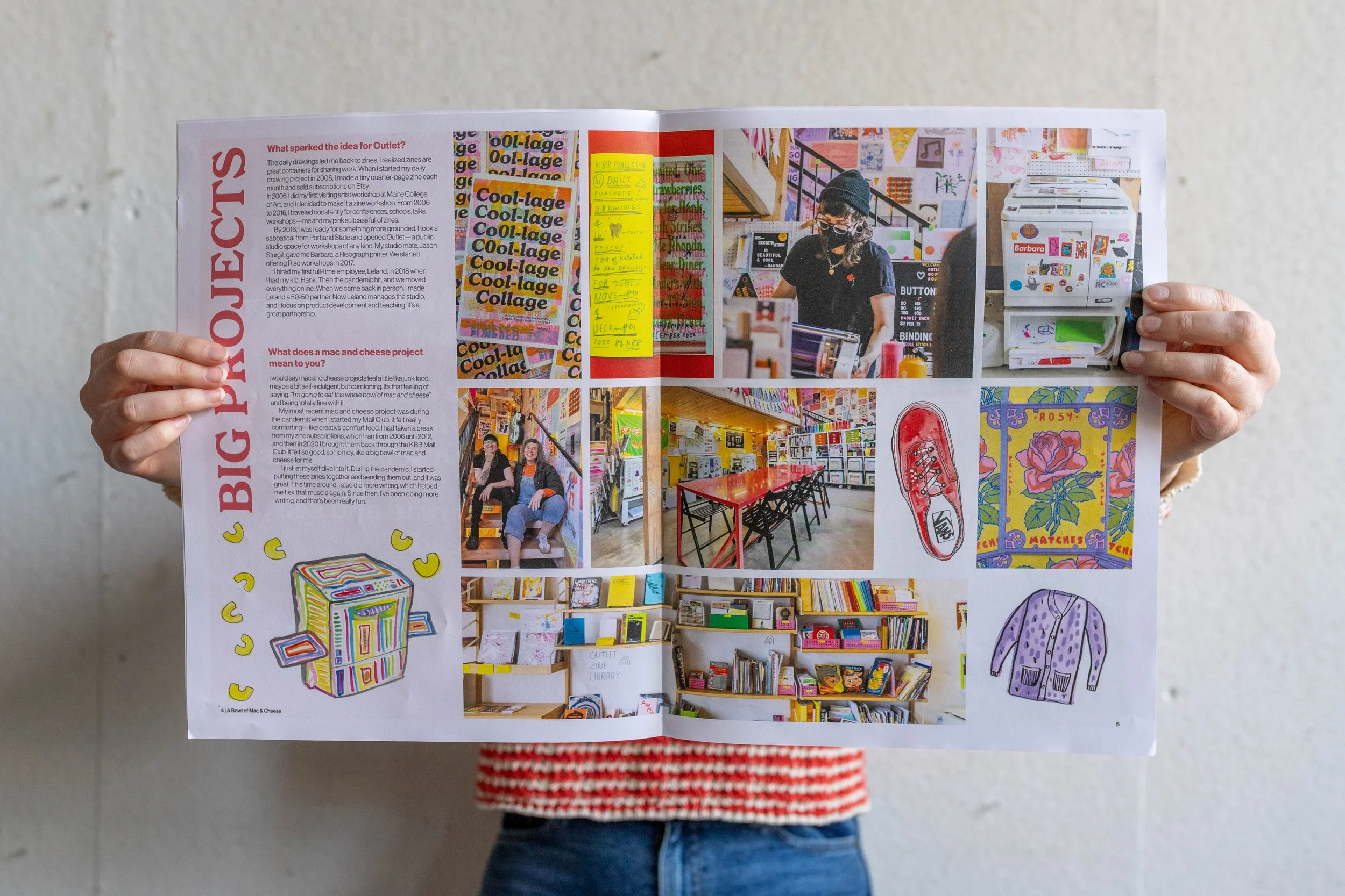
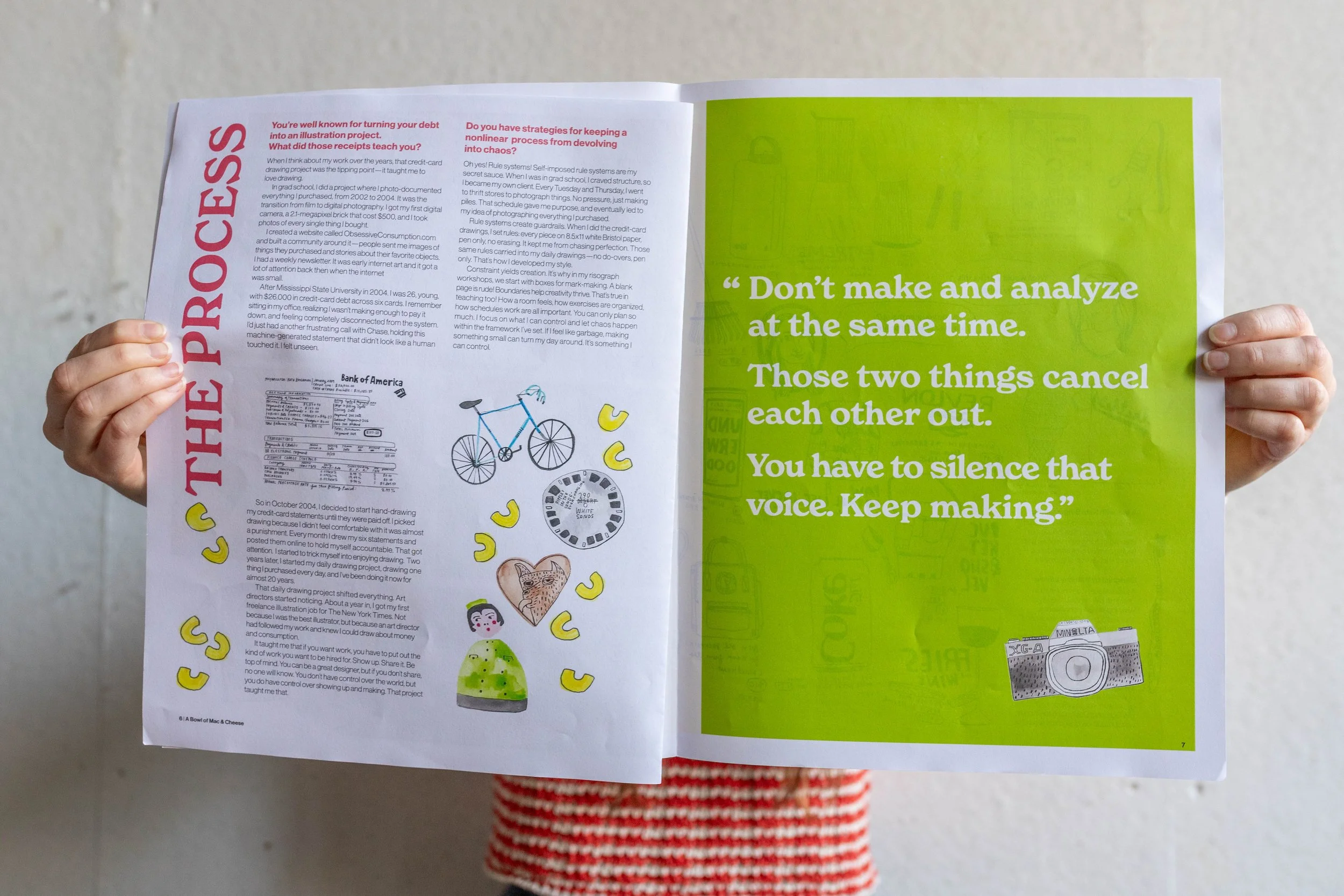
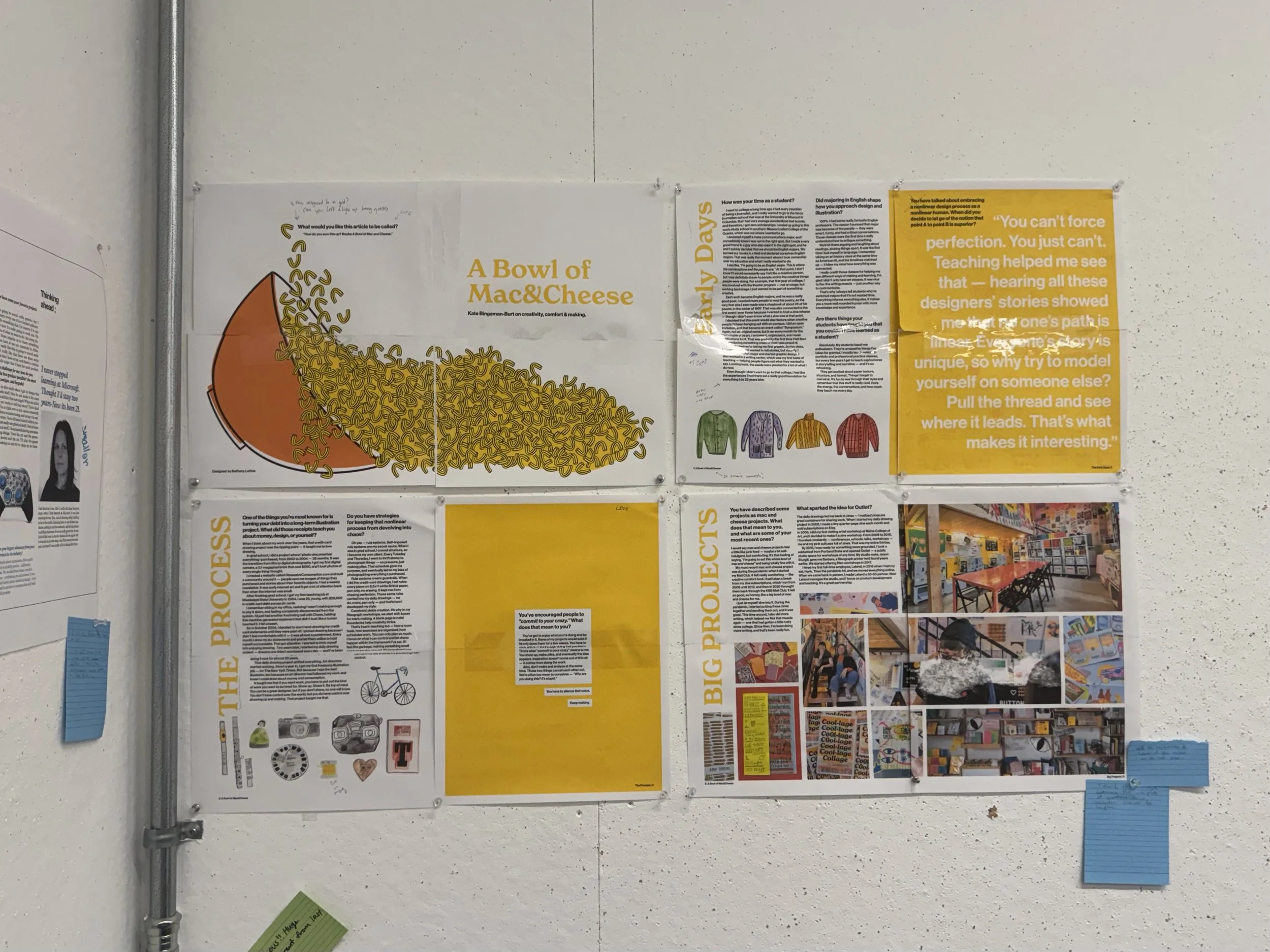
Designed a tabloid layout and mobile site with strong type hierarchy, pull quotes, and image driven spreads that keep the story clear and playful.
Process
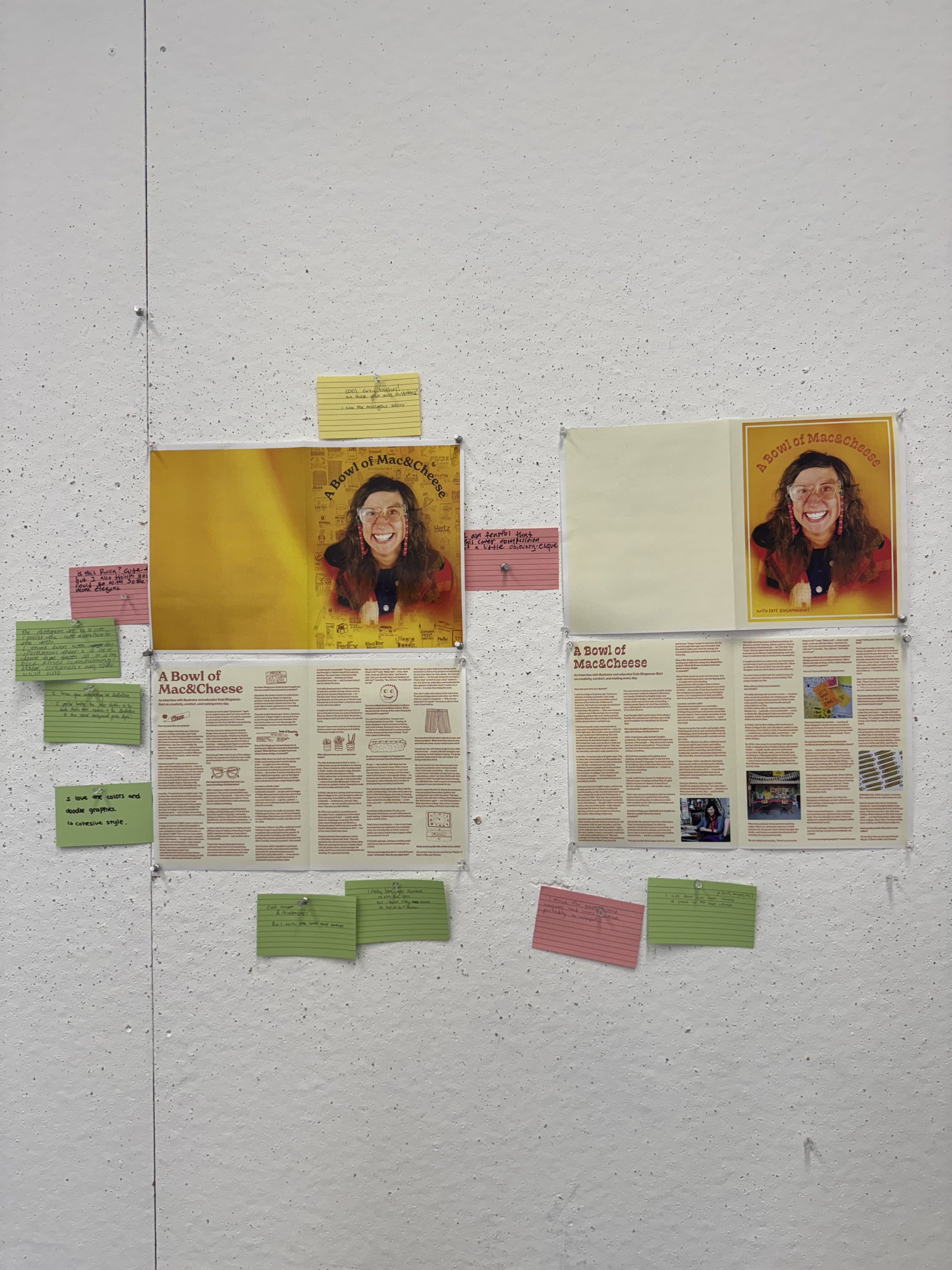
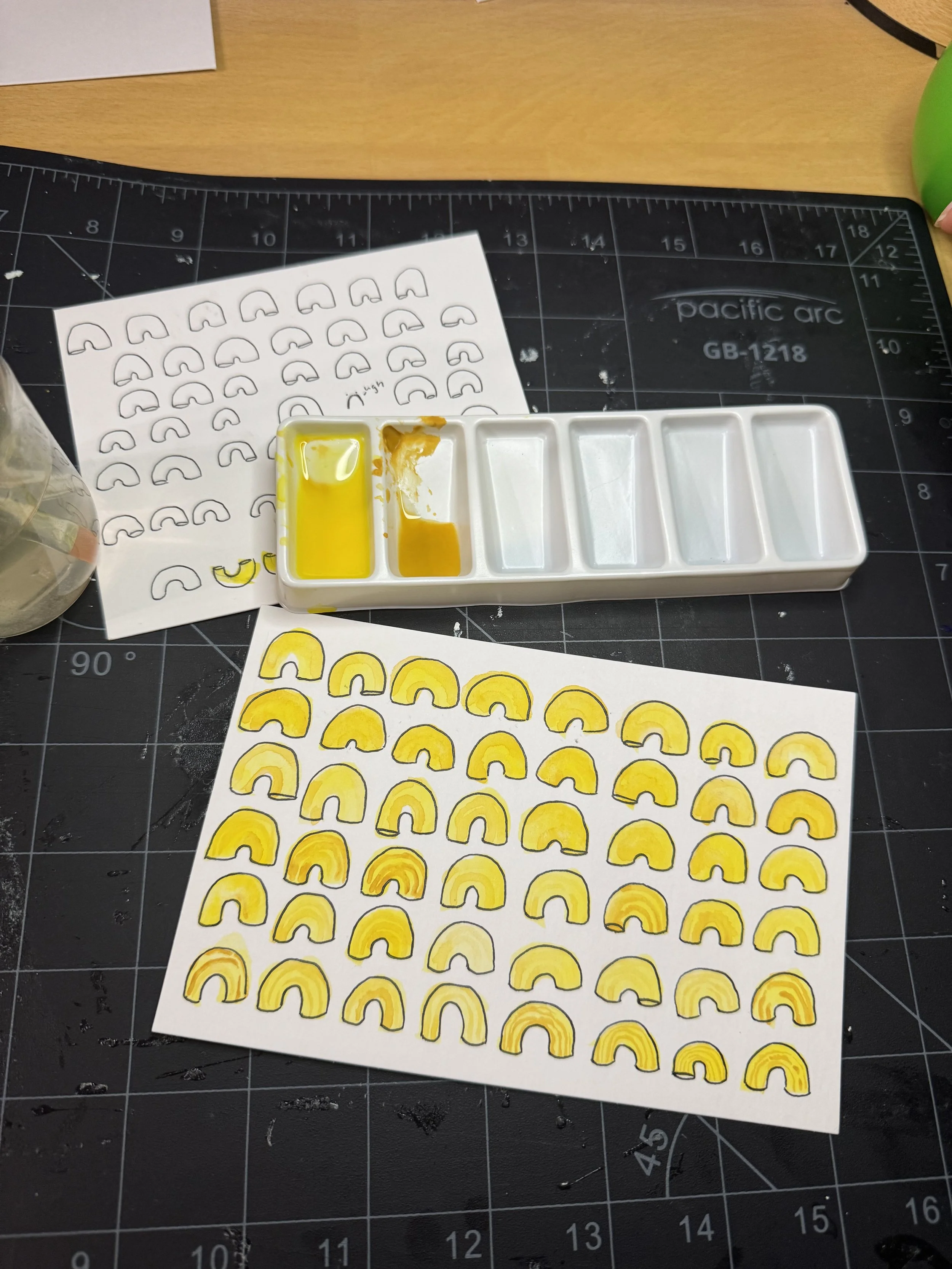
I started by preparing questions, conducting the interview, and editing the transcript into clear sections. From there I sketched and built many different versions of the tabloid, saving over a dozen layout variations as I tested grids, type scales, and image placement. Once the pacing felt right, I translated that structure into mobile wireframes and hi fi screens that kept the same rhythm and emphasis on Kate’s voice.
Mobile
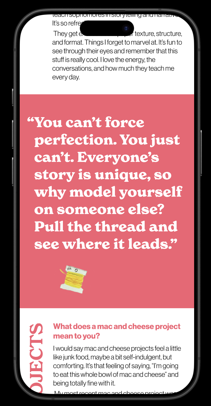
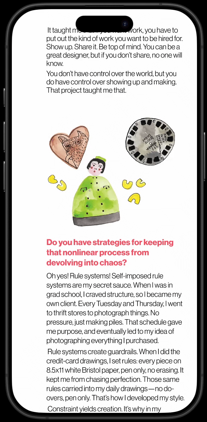
For the mobile design, I translated the tabloid into a scrolling experience that kept the same energy while making the interview easier to read on a smaller screen. I focused on clear sections, strong pull quotes, and playful moments of image and type so the page still felt expressive without becoming overwhelming. I also created small GIFs from Kate’s drawings to bring more movement and personality into the site, helping the digital version feel lively and connected to her illustration style. The goal was to make Kate’s voice feel immediate and personal while giving readers a simple and engaging way to move through a longer conversation.


Lessons Learned +
Moving Forward

Editing Kate’s interview taught me how to shape a long conversation into a clear story without losing her humor, honesty, or energy.
I also learned the value of trying many variations before deciding what stays. Each new layout showed me something about pacing, hierarchy, and how readers move through a page or screen. It reminded me that good design often comes from small, patient changes rather than one big idea.
Moving forward, I want to keep building projects that center real voices and lived experiences. This interview made me excited to create more designer features that live in both print and digital spaces. I hope to keep refining this system and grow it into a larger series that celebrates creative communities the way Kate does.