SUB POP
A hand-carved symbol set for a Seattle based record store.
My Role: Concept Development, Illustration, Brand System Design, Motion Design


Problem:
How to create a flexible set of symbols that could extend the brand’s visual language across merchandise, print and digital without losing the raw spirit that drives Sub Pop.
Solution:
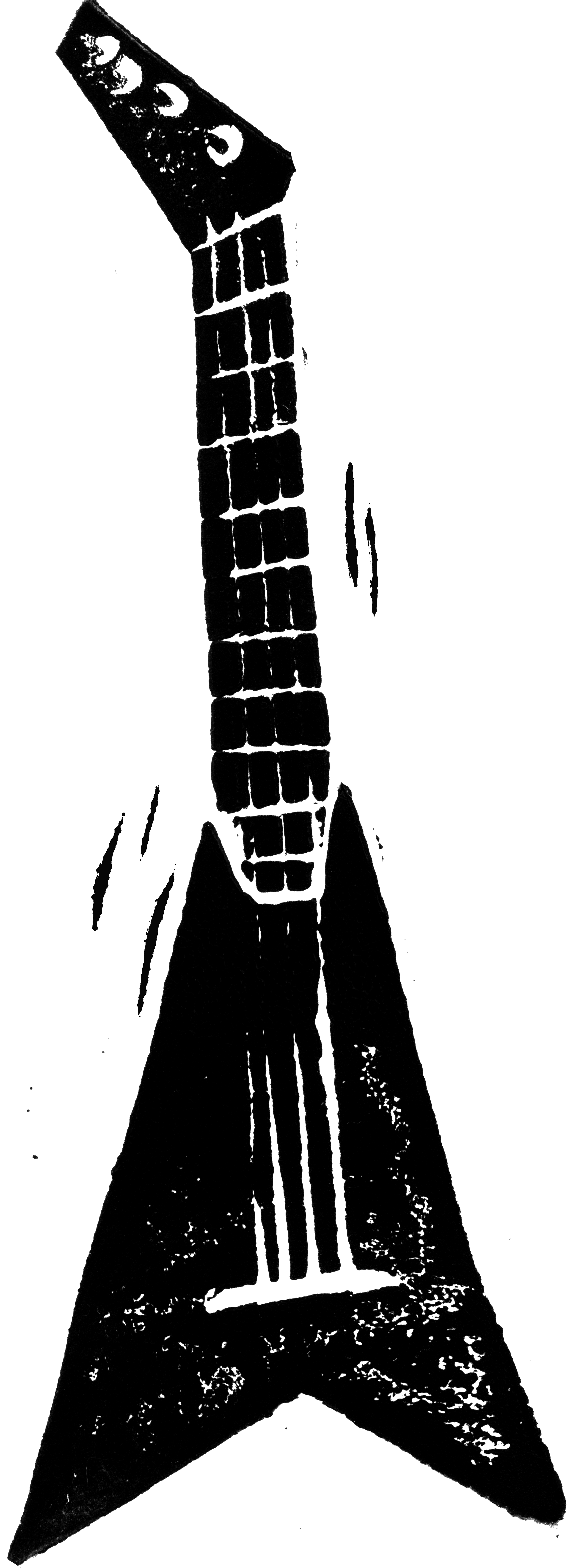
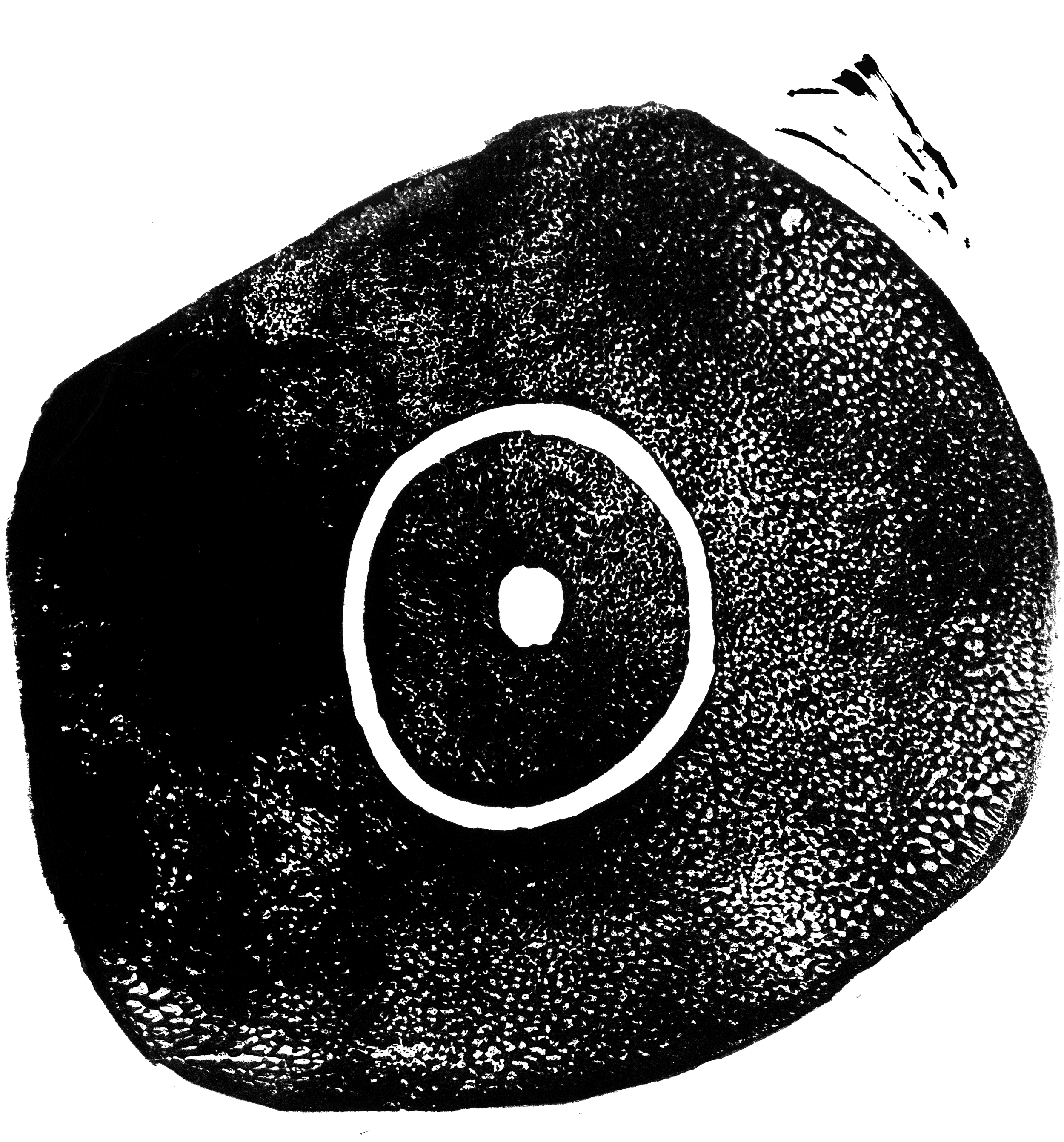
A custom set of hand carved stamps inspired by the label’s grunge roots and DIY history.
Project Overview
Process
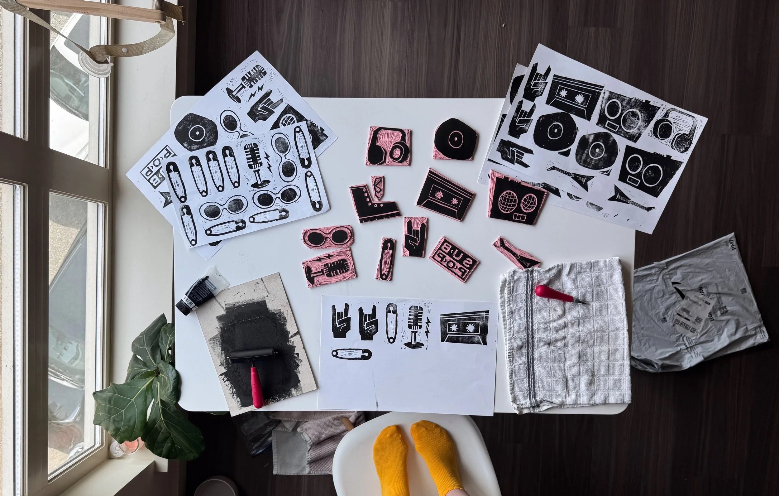
Each symbol began as a pencil sketch, refined for clarity and balance. Once the drawings were finalized, I transferred them onto soft linoleum blocks and hand-carved each design using a fine gouge.
After carving, I rolled black ink onto the blocks with a brayer and made several test prints to adjust pressure and alignment. The textures that appeared naturally from the ink and carving became part of the design’s character.
When the prints dried, I scanned them at high resolution and cleaned them digitally while keeping their handmade quality intact. The final set was then vectorized and arranged into a cohesive system ready for print and motion.
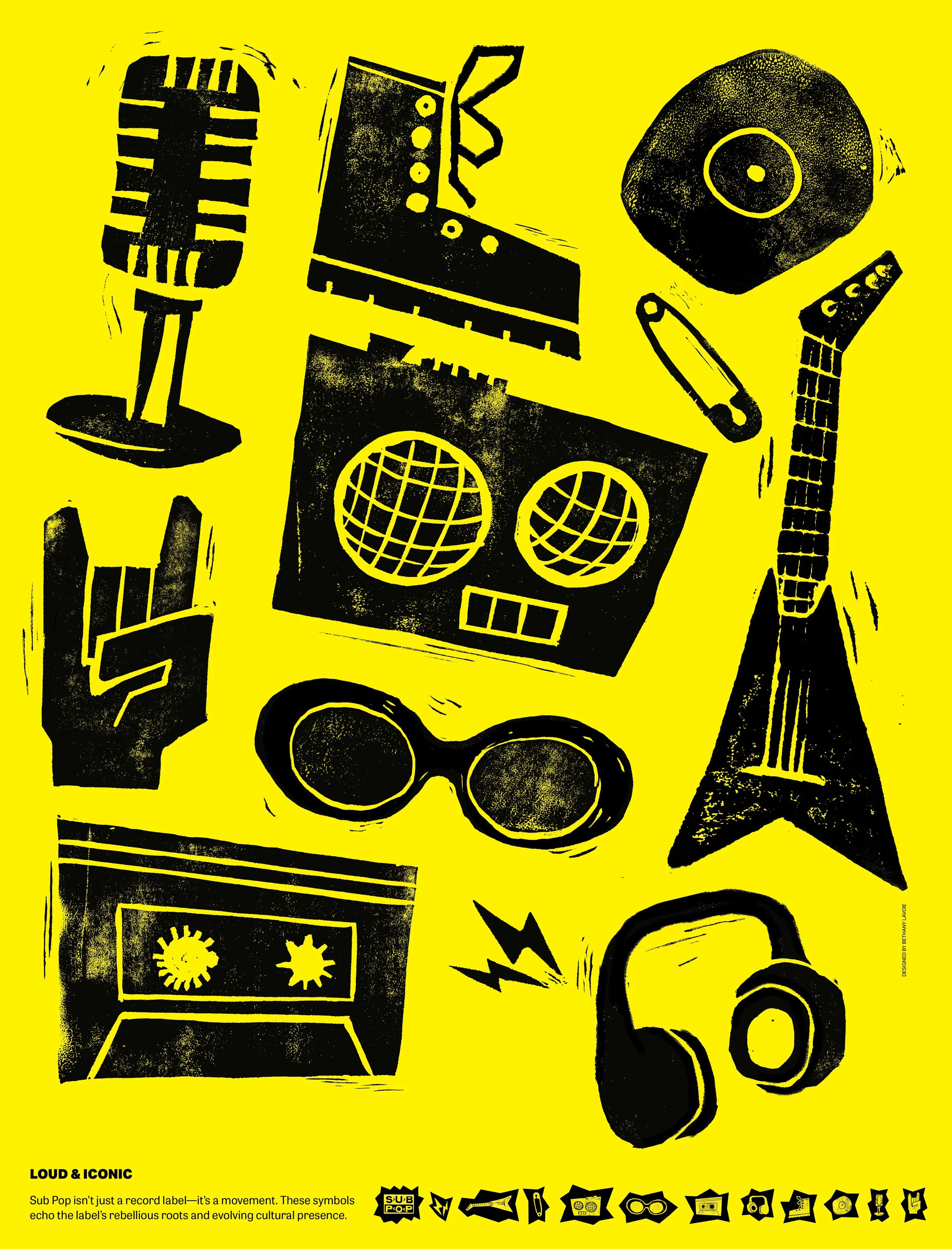
I chose to represent the symbols in the same way Sub Pop exists; loudly! The rough textures, high contrast, and loud yellow background capture the raw energy and rebellious spirit of the label.
The Poster
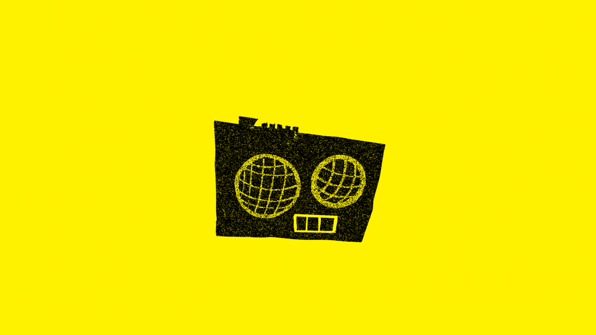
These micro animations extend the Sub Pop symbol system into motion. The microphone was designed as a toggle and could be used to switch between mute and unmute.The radio acts as a loading animation.
Motion

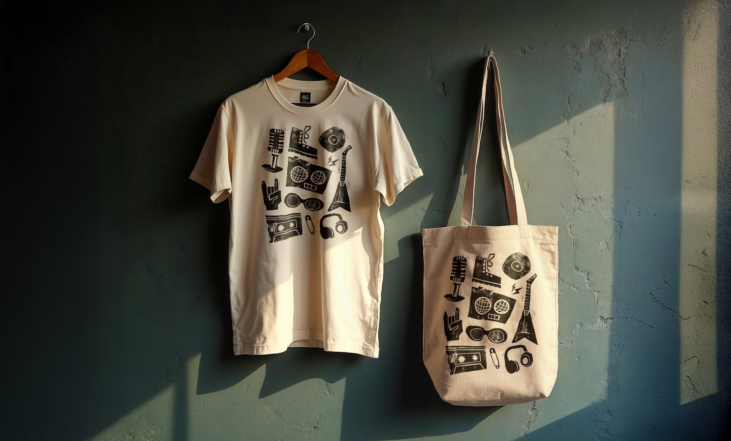
Applications